Are you in the middle of designing your fashion brand marketing strategy but still asking how you can make it stand out among the crowd?
Either if you run an e-commerce or a fashion startup, I bet your main aim is to push your customer to buy your product and become loyal to your brand.
That’s absolutely understandable and I know that feeling!
You’re off to a great start, and that’s why I’m going to show you the weapon you’re looking for to make your inbound marketing strategy be as valuable as possible: the Call-To-Action (simply called as CTA).
A Call-To-Action, literally a call to take an action, is a simple quote that usually consists of a short number of words, which are supposed to push your buyer persona to take an immediate action.
Just to have a quick idea, I show you the most used ones in the fashion industry:
- Experience the [benefit of a product]: usually chosen to call back to a strong emotional benefit related to a highly-desirable product;
- Get [discount] while supplies last: the classical marketing tactic to infuse a sense of urgency to the customer;
- Get your [product] today, and get [an added benefit or free product]: adding a benefit to increase the customer’s motivation;
- Order your [product] today: another way to communicate urgency to the customers, while also giving them an instant feeling of gratification;
- Buy now / Shop now: the most used CTAs that go straight to the point.
At the heart of those simple concepts, there is the specific action you want them to take, which might go from buying your discounted product to get a free ticket for attending a fashion event, and can be placed everywhere: on your social media ads, blog, website, or newsletter.
Pivotal elements of a strong CTA
The CTA examples can be innumerable, and each industry or market field may easily find the ones that fit them the most.
And here comes the tricky part of the story: having so many choices at hand can easily become a trap that leaves you open to error!
Therefore, choosing the right CTA – or better, CTAs, because you can use more than one at once – is a step that must be taken in a rational manner. In fact, in order to create an effective CTA that will be surely clicked on, you should pay attention to the following elements:
- Copy: even if the CTAs consist of just a couple of words, you should choose them wisely and creatively, always making sure they fit your brand voice and marketing purpose, as well as explicitly tell your visitors what they’re getting in exchange for their click. Those words should really make people want to act, so they have to involve actionable verbs and/or adverbs that catch your target’s attention.
- Design: this is an essential aspect of your CTA. In fact, colors and visual materials grab the customers’ attention twice as much as the simple written text. It’s normal, considered that the human mind works by frames and stories. So, let your CTA be visually visible to get noticed, but never forget that its appearance should always fit your brand design! Moreover, be sure it appears large enough (according to HubSpot, the CTAs that perform the best are around 225px wide and 45px high).
- Landing Page: finally, opt to take your buyer persona to a dedicated landing page after clicking your CTA, rather than an existent page on your website, in particular if the CTA is going to be built around a special offer or product.
Impressive fashion CTAs to take inspiration from
1.Madewell
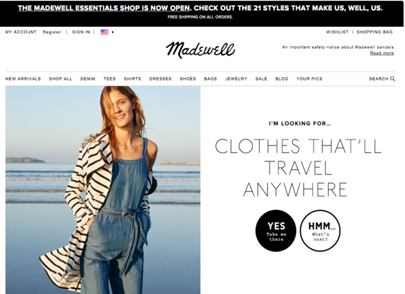
Madewell has always had an above-average website design, taking its e-commerce website to the next level also thanks to its valuable CTAs.
One of their CTA formulas has been built around a short but impressive gamification storyline that goes right to the heart of a buyer persona who’s prone to adventure and travelling, by making the website navigation playful and psychologically appealing.
Going into detail, when the customers arrived at the page, they were greeted with the text: ‘I’m Looking For… Clothes That’ll Travel Anywhere’. Below this copy, there were two powerful CTA buttons: ‘Yes, Take Me There’ and ‘Hmm… What’s Next?’.
This kind of gamification formula allowed them to offer the customer a choice between two different actions: giving a look at clothes that are suitable for travel or be taken to the next type of clothing, doing it again and again as they browse the categories.
2. Shopify
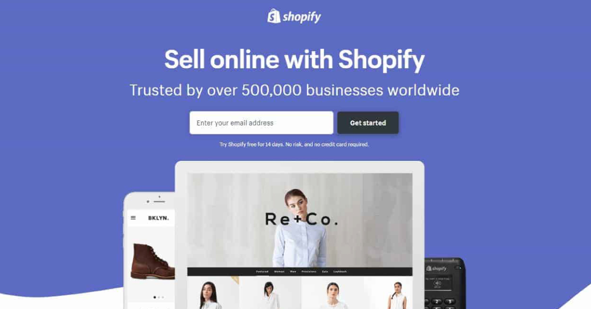
Let’s shift from a website CTA to a social media one: in the specific, a Facebook mobile-first ad!
Everyone knows Shopify, the e-commerce platform that lets fashion businesses open and manage their online shop.
Yet, you surely know that Facebook and Instagram are offering their online shopping features, as well: that’s why Shopify launched this offer to its buyer persona to create and customize a store directly on Facebook, so that their products can be easily bought from the social platform users!
What they did was to create a CTA formula that is really straightforward: ‘Sell Your Crafts on FB!’ and ‘Sell online, in-store, and on Facebook…’.
On the other side, they completed the ad with a clickable CTA button, a simple but noticeable ‘Learn More’ that leads you right to an external landing page.
3. AYR
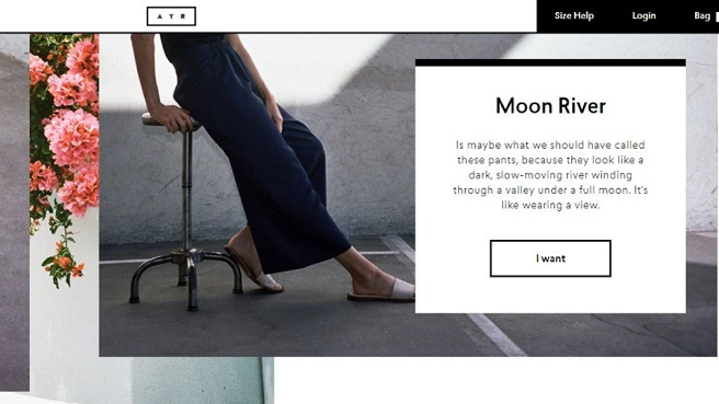
The US clothing brand AYR opted for a storytelling and metaphoric description of its product, ending up with a short but particular CTA button: ‘I want’.
Instead of using a classic fashion CTA that asks you to do something, like the most used ‘Buy now’, the company often choose to talk from the perspective of the customer, using the first person singular.
Indeed, words like ‘Mine’ and ‘I want’ tend to awake the customer’s inner desire for the product, and psychologically work far better than using verbs that directly ask them to shop.
What’s more, in other sections of the website, the brand uses a conversational language to instil a sense of fun and mystery.
For instance, they use ‘It’s super fun’ or ‘It’s fun, come hang’ as CTAs to ask visitors to check their physical stores, unconventionally encouraging the customer to discover why taking that action should be so interesting.
Those examples are just a few ones between many others that demonstrate how copywriting strategies, storytelling, and sometimes even gamification, are becoming a real asset when it comes to choose the right CTA.
Simple CTAs like ‘Buy now’, ‘Discover more’ or ‘Follow us’ still work greatly, but why not amaze your audience with a more psychologically-driven CTA that can potentially assure you more leads, conversions and brand awareness?
Now, it’s up to you!
Do you want to have some more weapons to face out your content marketing strategy at best?
Download our editorial calendar right now, and start to accomplish new markets worldwide!
